Ghost Buttons and their impact in web design

After the wide spread of flat design that dominates web design since 2014, there is one style that caught our attention.
So what exactly is “Ghost Button”?
You definitely seen it before. It is those transparent buttons with a thin line border and text on the inside. They are commonly found in flat design and usually in a big rectangular shape that are easily spotted. Before the flat design came out, no one will know that this is a button. But in today’s world, you immediate associate that style as a clickable button.
It is called “ghost” because of its hollow design like phantoms and yet able to attract the visitors’ attention easily, like a ghost haunting your mind and force you to look at them.
The Origin of “Ghost Button”
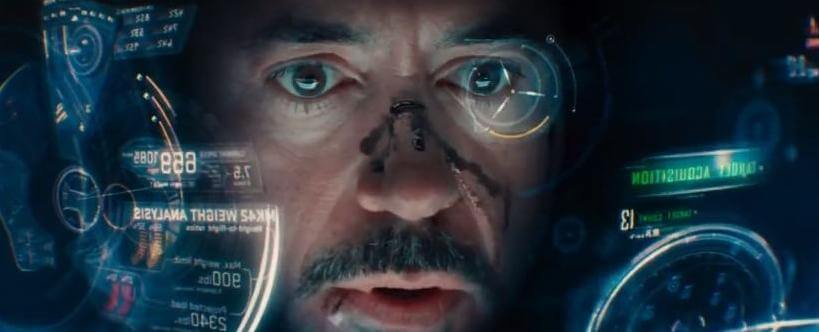
No one really knows who invented “Ghost Button” but it is most probably evolved from “Ghosty UI” or Head-Up Displays (HUD) like you see in the Iron Man movies.

In the HUD, there are so many data being presented right in front of wearer’s face and hence, the need to present those data in a lightweight style so as not to obscure the viewport. Ghosty UI is the best approach for this as it allows the wearer to see through the data with the transparent layout.
Since then, many movies have start to exploit this Ghosty UI and even in holograms.
We suspect all of these provided early inspirations for the current ghost button web trend.

Along with the push of a tech giant, Apple, the “Ghost Buttons” are seen in many apps on the iOS devices.

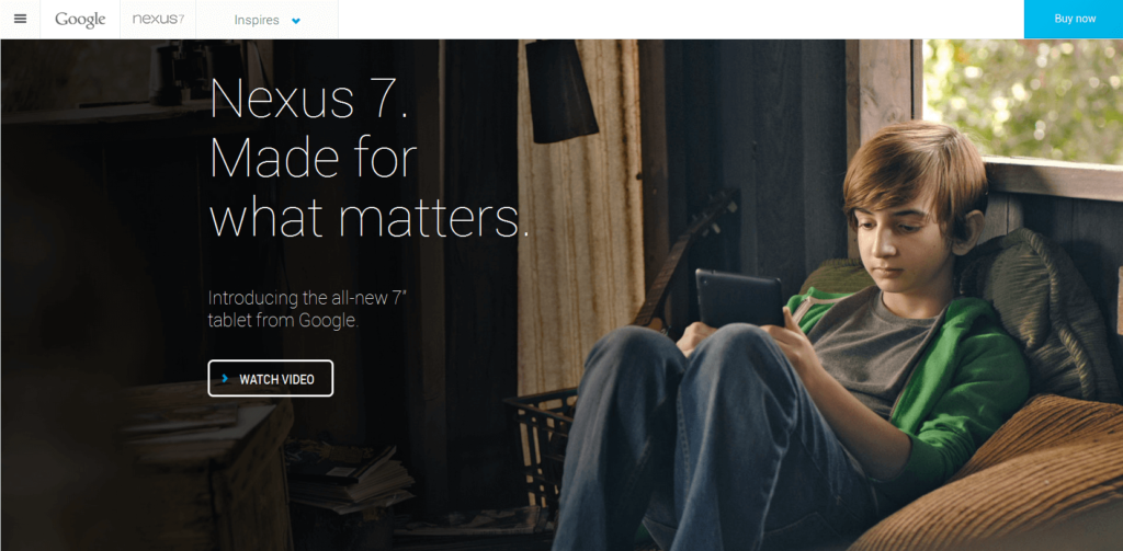
And recently, Google has started to follow this trend as well.
Let’s study this “Ghost Button” on it’s pros and cons.
Pros
- Ghost buttons are easily created without much knowledge in design. Almost all web designers are capable of creating one.
- Not only are the buttons easily created, they usually give an elegant, finished look to a design and works very well with call-to-action.
- Because of it’s transparent and linear design, it gives an idea of freedom subtly. It helps to lighten the visual weight on your design.
- As it is in the latest web design trends, by incorporating these ghost buttons, your website will definitely get a boost on its appeal.
Cons
- Even though these buttons are easily created, the placement of such buttons requires a deep knowledge in design. When placed wrongly, these buttons work against you and hide it from the viewers like a ghost.
- The use of colours are also very tricky with these buttons. As they have a transparent background, you need to take into consideration of the contrasting colours to make them stand out.
- Ghost buttons can be tricky to use over images with highly contrasting or varying colors. Typically these buttons are white or black. If you have an image with alternative black and white spaces, a ghost button can be near impossible to be seen.
- Over in Singapore, there are still a population of people who are not tech savvy and not up-to-date with the latest design trends, these buttons are less intuitive to them as the traditional 3D-feel of a button.
Here’s an example of a bad colour choice to integrate with the background image:

The white colour blends with the model’s white top and makes it hard to read the words and the words “Partners in Imagemaking” confuse the viewers if it is a ghost button or a title with a border.
Gallery
Let’s take a look at some other good examples that you can learn from:


