Guidelines For A Good Web Design

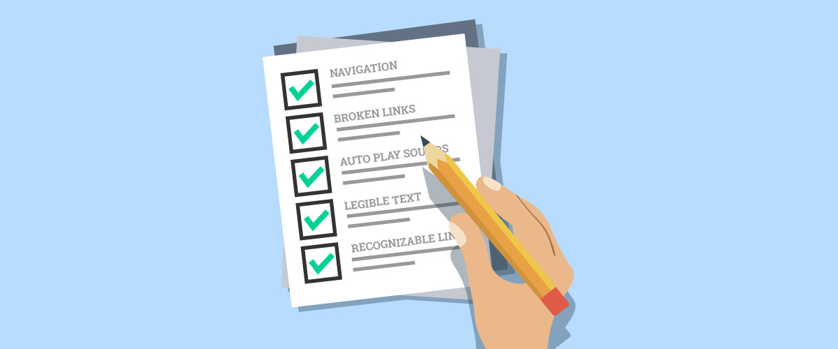
When it comes to web design, there are many guidelines to follow closely in order to create a good user experience. We have prepared a list of pointers that you should consider when you are planning for your next website.
1. Easy-to-use Navigation
The navigation menu is one of the most important elements of any website. It needs to be simple, clear and consistent across all the web pages. Do not clutter the main navigation menu with every page link on the site.
By having lesser menu items, it actually encourages users to make quicker decisions to get the information they need.
2. Ensure No Broken Internal Links
No one likes to land on a 404 error page. When users are searching for information, they expect every link to take them where it says it will. Even search engines dislike 404 error page and will penalize your site if there are 404 error page on any of your internal links.
You can check for broken links at http://www.brokenlinkcheck.com/broken-links.php.
So remember to scan through the entire site and make sure all the internal links are valid.
3. Do Not Auto-Play Videos With Sound
Auto-play videos with sound or music from your website is a bad idea, period. This is intrusive for users who might be listening to music or in a quiet area. If a video must be auto-played on load, consider muting the audio of the video so that it is not intrusive to the users. Even W3C’s specification agrees with us.
4. Make Sure All Text Are Legible
The design of the site should not affect content consumption. One common mistake is having a busy background image that interferes with the text on it. If you need to place a background image, make sure the text on it has a contrasting color to stand out from the background for both desktop and mobile view.
5. Make Clickable Elements Obvious To Users
The common approach to make links and buttons easily recognizable is to highlight them with a different color. However, with the introduction of flat design, flat buttons might not seem obvious to some users. To prevent that, make sure there are no other elements that remotely resemble a flat button.
The other approach to resolve flat buttons is to use “raised buttons”. Raised buttons add dimension to a flat design layout by having a shadow around the button box.
Conclusion
These guidelines might seem obvious but are usually overlooked. So before you launch your new website, you might want to go through these guidelines to have an appealing, inviting and easy-to-read website.

