Layout And Composition: The Unsung Heroes Of Web Design

There are many design decisions made that most web design Singapore clients do not fully comprehend. In this post, we hope to educate them (and you) on some of the building blocks that influence our decision on the website’s layout and composition.
In many ways, layout and composition are the foundation of web design and are the purpose of having the wireframes. They give your website structure and make it easier to navigate, from the margins on the sides to the content in between. Without a well-thought wireframe layout, your website will basically fall apart.
There are six basic principles that are used to iron out your website wireframes and content. So you can keep these in mind for your next web design project and notice how these six principles are being applied.
1. Proximity
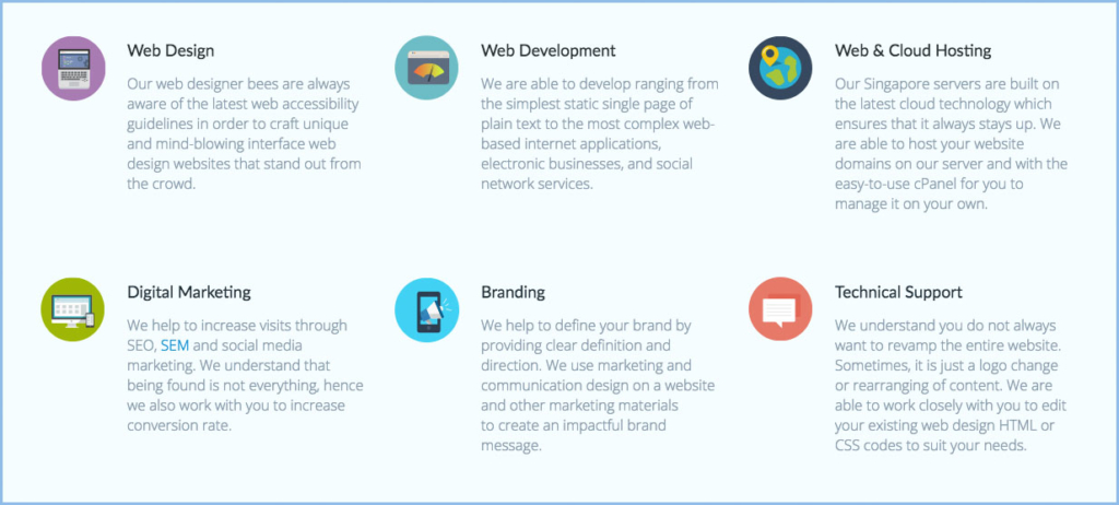
Proximity is about using visual space to group the related content together. For instance, if an icon is used to represent a given content, the icon should be grouped together with the content. Likewise, for content that is not related should be separated visually to show the lack of relationship. In the example below, you can easily tell which icon belongs to which point because of the proximity of the icons and the text. This will make your website content easier to understand at a glance, whether it’s just text or something more visual.
In the example below, you can easily tell which icon belongs to which point because of the proximity of the icons and the text. This will make your website content easier to understand at a glance, whether it’s just text or something more visual.
2. White Space
White space is commonly used to separate different sections of any given web page. This doesn’t mean literal white space, it just means “negative space”. It helps to differentiate one section from the other and give your content room to breathe. If you feel the content are cluttered, you may want to give a little more white space to spread the content out.
In the example below, you can easily see the definition of two different sections and look aesthetically pleasing.
3. Alignment
Alignment is something you are well aware of already. When you type a document or an email, the text is aligned automatically for you. However, when it comes to aligning images and objects, getting it right may be tricky. One common approach to lay out content on a web page is to imagine an evenly spaced and aligned grid. If you have 3 points to layout in a row, you have to imagine that there are 3 columns with equal gaps between each point. The goal here is to be consistent in your alignment and attention to these small details.

4. Contrast
Contrast is mainly used to catch the reader’s eye or to emphasize a particular point. We normally use colors and styles of text to highlight the importance. For example, A highlighted and bold text will be more likely noticeable and effective in communicating its message than a regular text. Likewise, a light gray text is usually used for non-important stuff and gives the reader the impression that he or she should ignore it.
Most people don’t read all the content on the website, they scan quickly. Hence, they rely a lot on recognizing character shapes and colors. You might be guilty of this too. By using high-contrast text, a reader is able to immediately recognize which content is of higher importance.

5. Hierarchy
If you have written a report before, you will know how a proper hierarchy looks like in a report with main headings and subheadings. Similarly, for web design, we use hierarchy to help readers navigate quickly through your content visually. We are conditioned to assume that a bigger font size has a higher level of emphasis. To establish such hierarchy is simple, just think through which element you want your readers to notice first, then make those stand out. High-level items are usually larger, fancier, bolder, or more eye-catching in some way.
6. Repetition
In web design, repetition is definitely required so that every page of your website has a consistent look and feel. This means certain elements of your website will be repeated throughout all your pages. For instance, the header and footer of a website are usually identical. Likewise for the choice of colors on the website. It’s not just for aesthetic reasons — being consistent can also make your content easier to read. When readers know what to expect, they can relax and focus on the content.
Putting It All Together
Layout and composition are essential to everything on the website. Hopefully, the principles you just learned will be useful to you on your next web design project. All it takes is a little attention to detail and you can create beautiful, professional-looking websites.