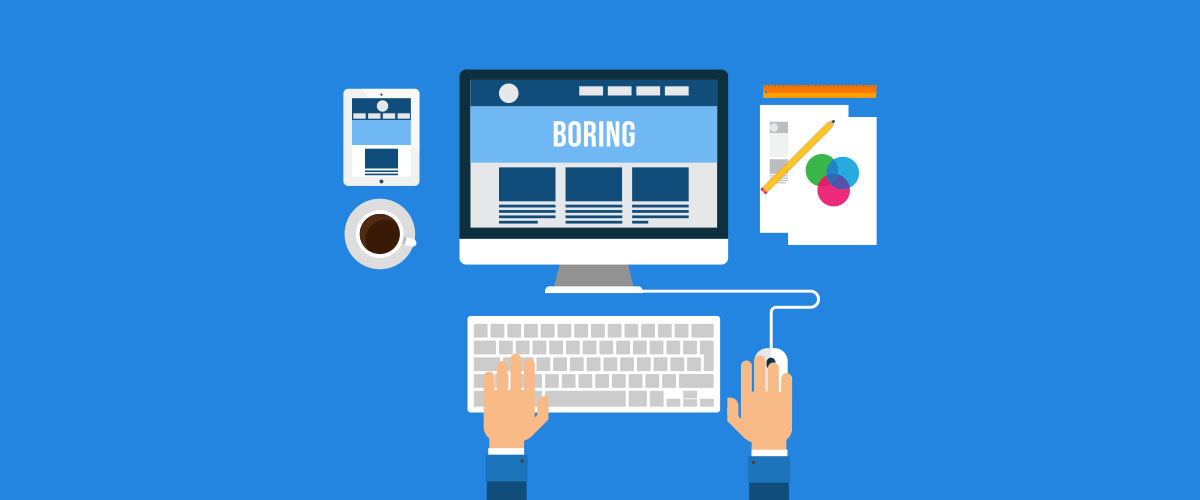
Web Design Is Boring

“Web design is getting boring.” “Web design is predictable.” “Most websites look alike.”
You might have heard these comments from designers, developers and spectators alike before. As a web design Singapore company, we will like to give our thoughts to these comments and hopefully, you will agree with us.
First of all, we think that these comments are only referring to brochure websites in general. And to a certain extent, it is true. Let us explain.
What is a Brochure Website?
A brochure website is a website that gives a web presence to a company or product. It also conveys a sense of permanence and credibility to the customers.
Other than showcasing the products and services, a brochure website usually contains valuable information about the company such as contact details, opening hours and how you can contact them.
Brochure Website Navigation is Boring
Most visitors don’t spend a lot of time on these sites. So the faster they are able to find the information on the site, the better for them. In order to achieve that, the website needs to have good visual cues for a visitor to scan the website easily.
One obvious way is to make the navigation boring so that it is always predictable. Predictability trumps disruption. There’s no better way to frustrate your visitors than making them figure out where are the website’s navigation links.
Brochure Website Header and Hero Section is Boring
Sure, almost every website has a horizontal top navigation with a full-bleed hero image. It seems like a standard for every website now. There’s no arguing about that.
However, you might not know that this is actually a proven simplistic approach to solve a problem. The horizontal navigation limits choice (reducing cognitive load) and maximizes screen space. The hero section is a powerful tool to communicate with the visitors effectively in a short amount of time. It helps the visitor to determine if this is the right website or not.
Think User First
Hopefully by now, you also agree that boring layout is better for brochure websites. But what most people forget is that these websites are supposed to serve the user’s needs and not to satisfy the designer’s ego. By casting the designer’s ego to do something different aside, we can focus on delivering an established method of communication to delight the users.
A good brochure website is one that can answer any question raised by its users without customer support, and that’s hard. It requires extensive research, survey, and experimenting.
Conclusion
Design is about solving user problems. We do not always have to reinvent the wheel just to make it “cooler”. We need to put the users’ needs first and that involves placing information in predictable places on the website. It’s boring, but it is kind.

